Silvesrhop Rebrand
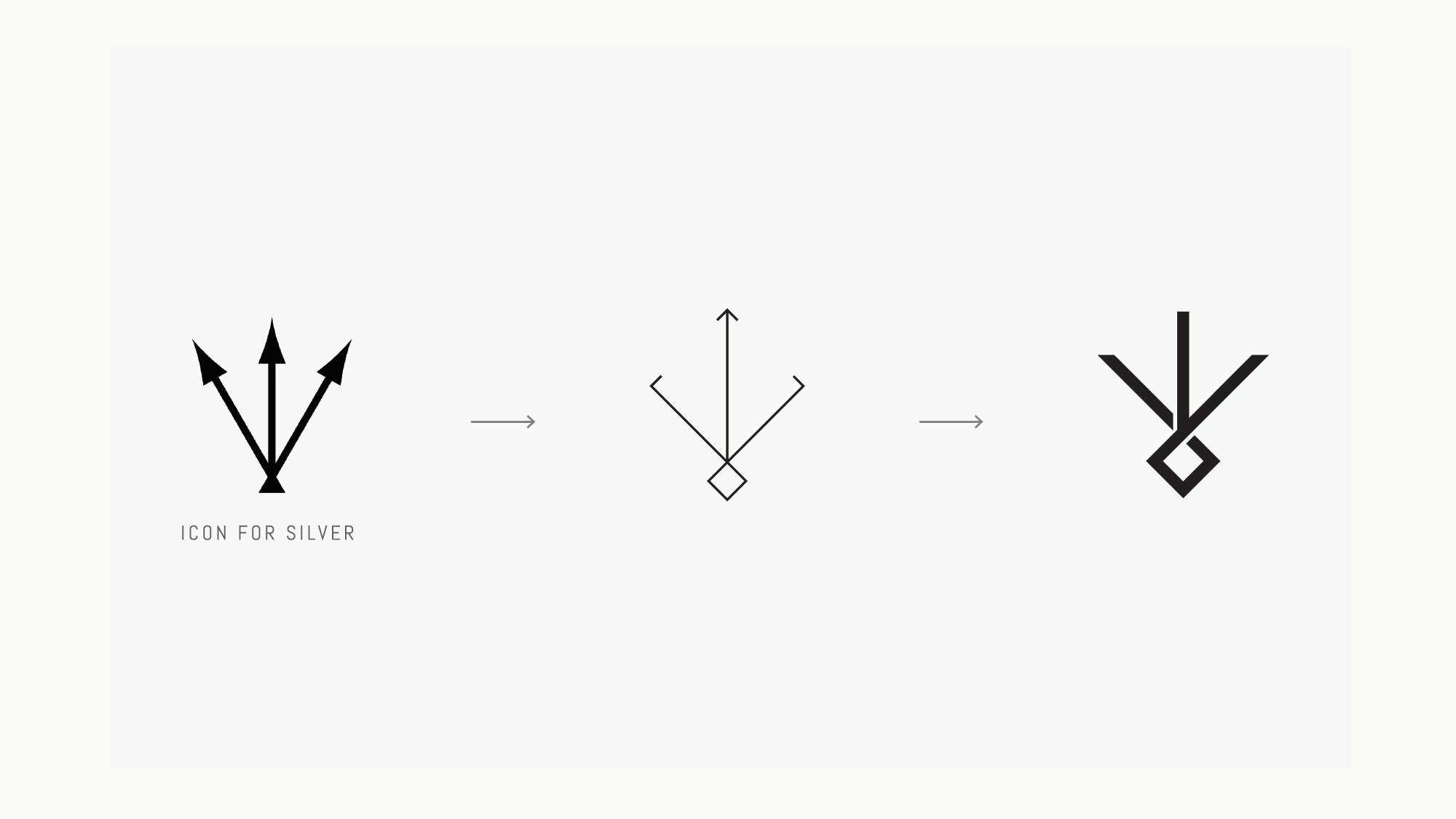
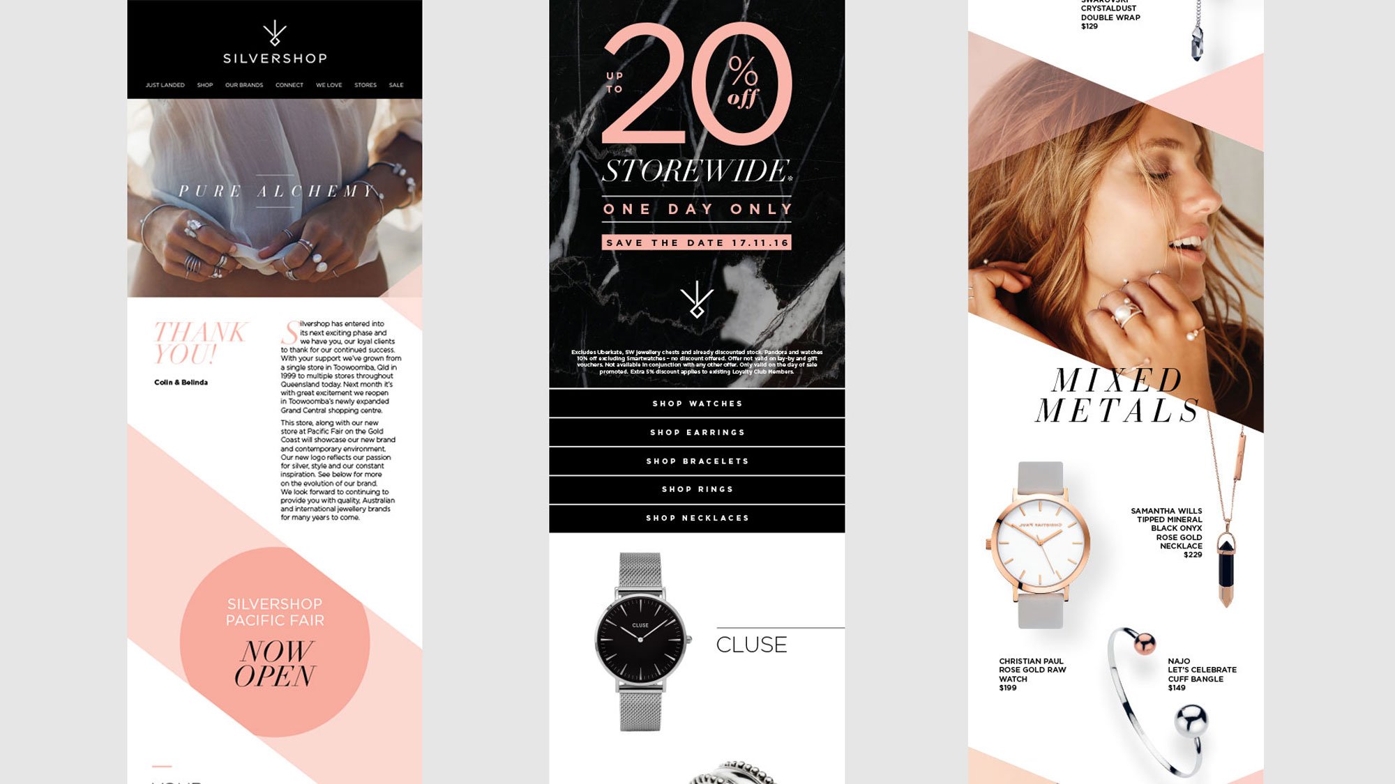
A locally owned and operated retailer with a strong reputation in the marketplace decided to take that leap and rebrand. Our brief was to create a brand that reflected the client’s passion for silver and style, and their hunger for continuous inspiration. Through our research process we came across the ancient sign for silver, a three-pronged symbol representing one of the seven metals of alchemy. We anchored the rebrand around this finding.
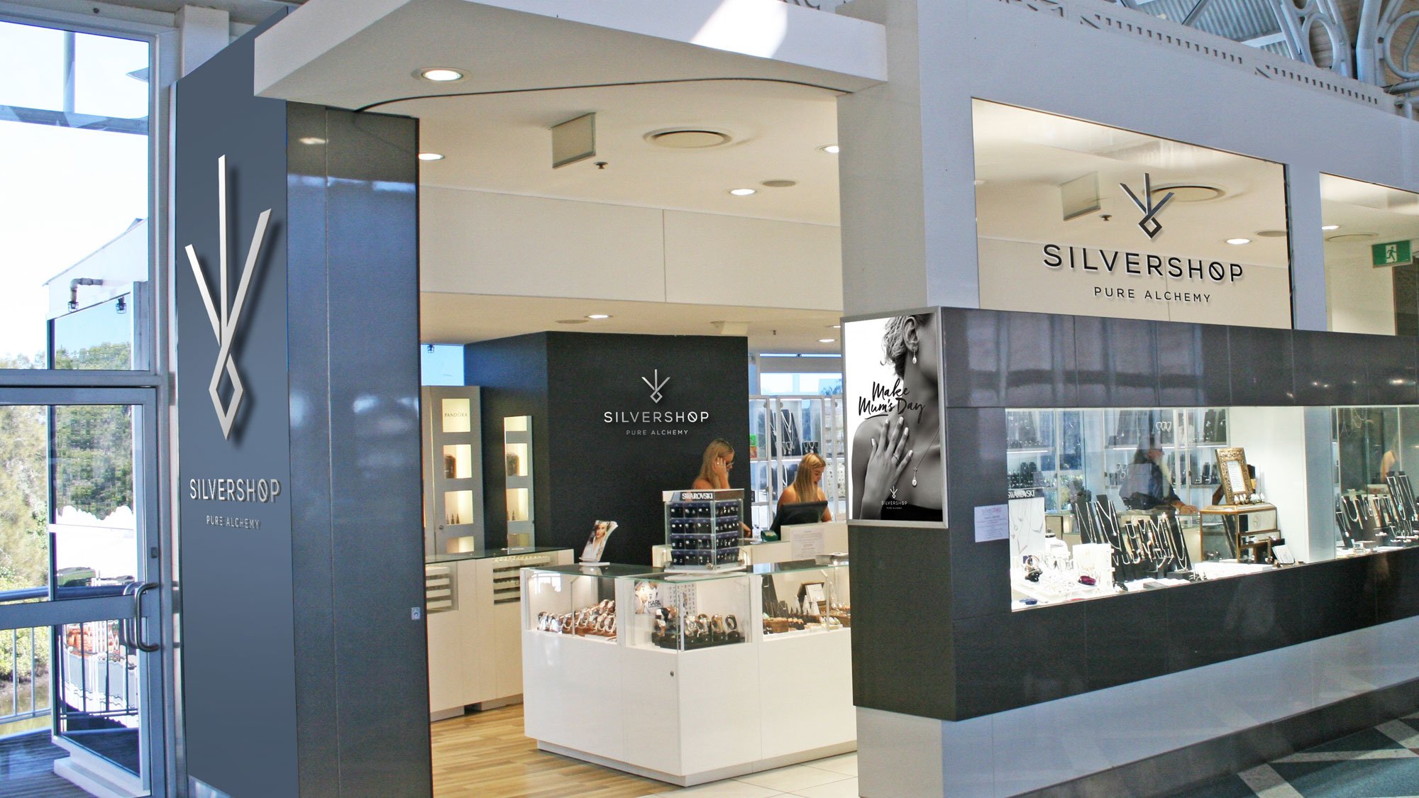
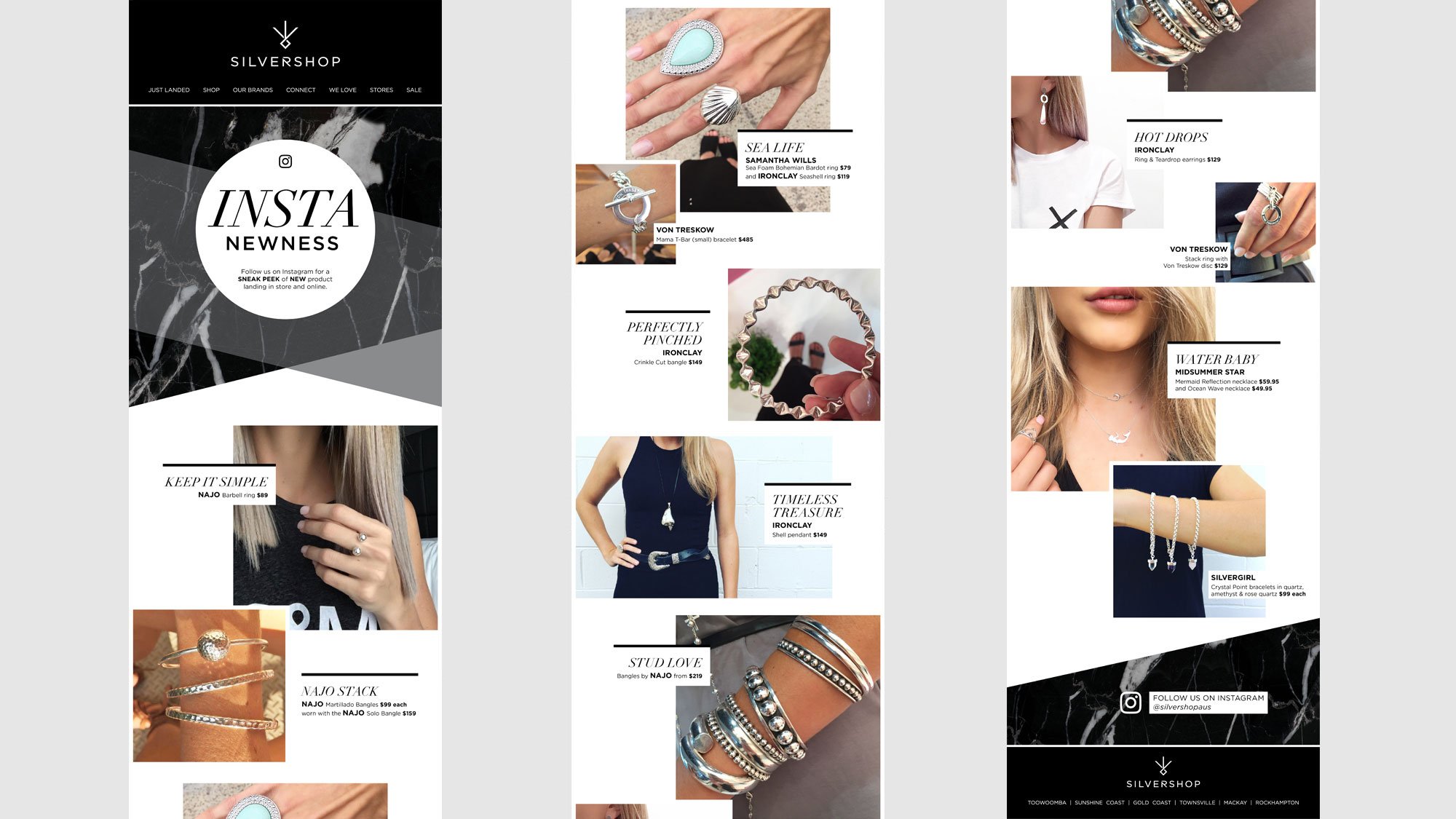
With a more contemporary colour palette of black, charcoal and white along with complementary pastel colours based on season, we captured the essence of Silvershop and their target market. The tagline “Pure Alchemy” consolidated the broader ‘origins of silver’ theme, and fit snugly with both Silvershop's brand values and their jewellery collections. The roll out is currently taking place across seven stores and a purpose built multi-channel ecommerce site.
- Brand Architecture
- Brand Guidelines
- Brand Positioning
- Brand Strategy
- Creative Direction
- Logo & Identity
- Electronic Direct Mail
- Seasonal Catalogues
- In-store Point of Sale
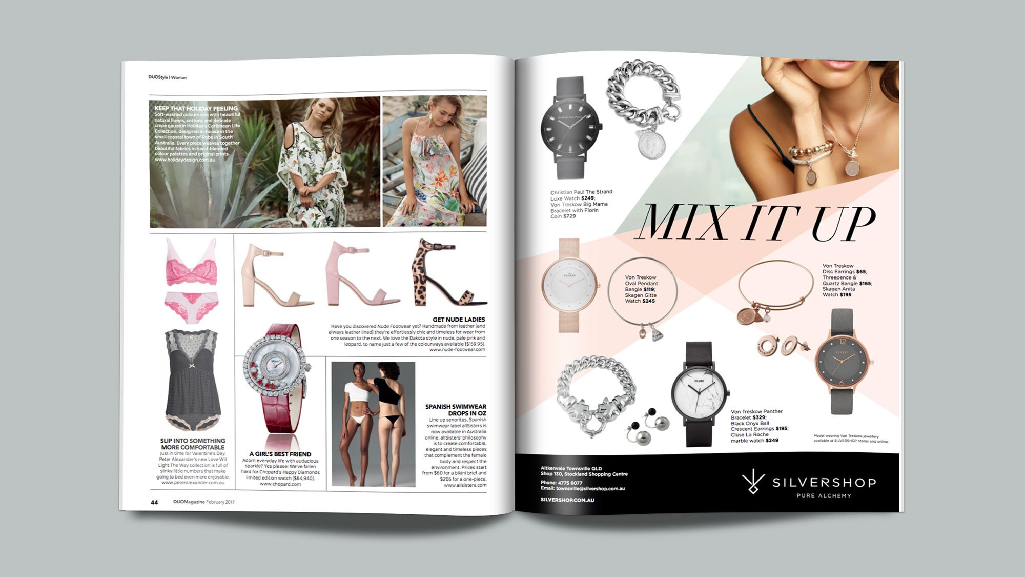
- Press Advertising



From websites to magazines, branding to video and beyond, if you have a project or idea we would love to hear from you.
Get in touch